Please note: All of these sketching trips on the London Underground were made well before any Corona virus restrictions were introduced.

When it first opened in 1979, I think that the full extent of new
tunnels for the line totalled something in the area of two and a half miles.
Which makes it a little surprising that the line took 8 years to build. There
was some extensive remodelling to combine the old Strand and Trafalgar Stations
into Charing Cross station, which also meant that the existing Charing Cross
Station was renamed Embankment. In terms of length, though, by far the majority
of the original Jubilee Line ran on existing tracks, which had previously
served the Bakerloo line, and before that, the Metropolitan. So it’s little
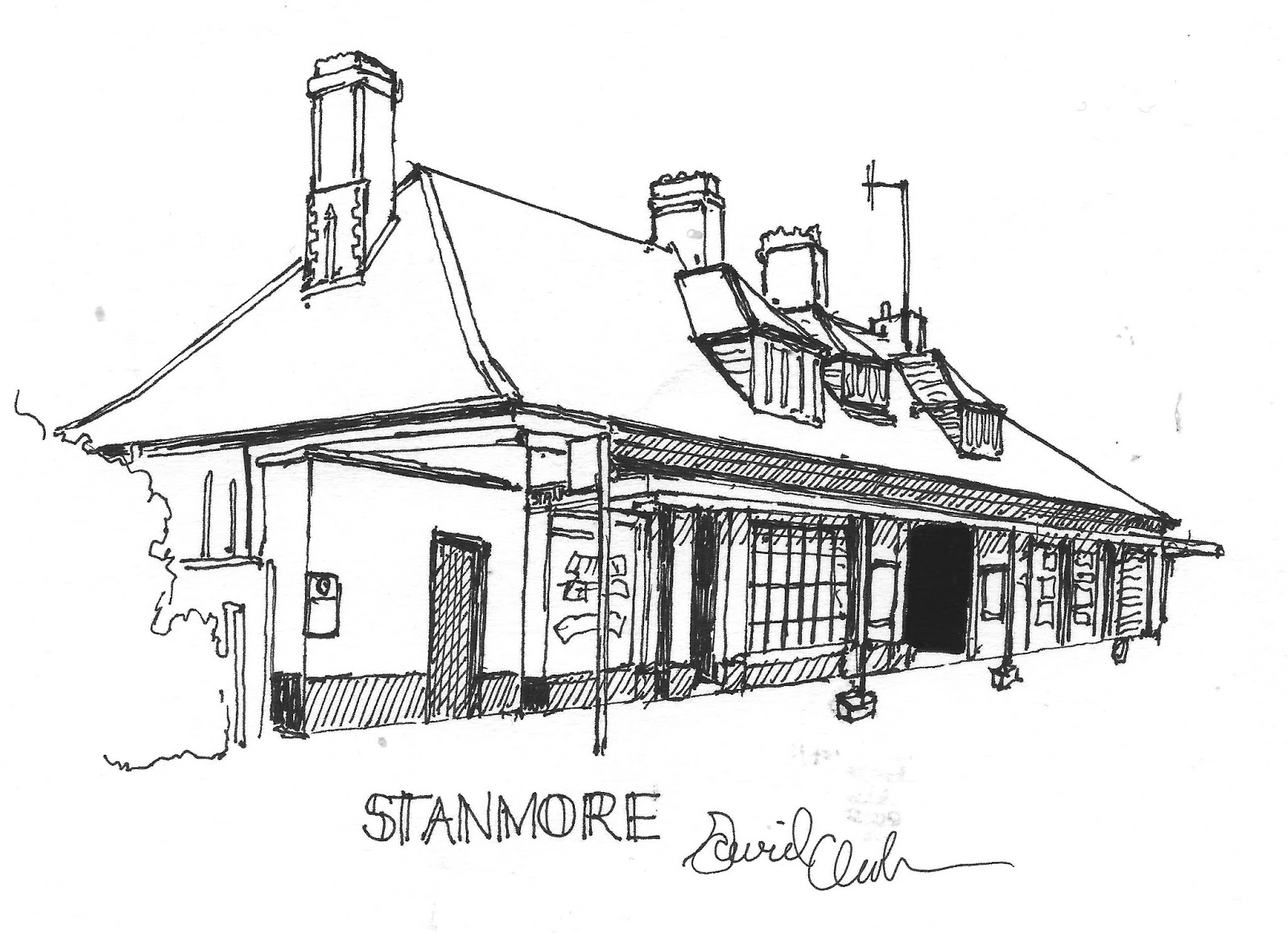
surprise when I arrive at Stanmore
station early doors to see that this 1930s Charles Clark station resembles his
stations on the Watford branch of the Met. 7 Years after the station opened
this part of the Metropolitan was transferred to the Bakerloo. I don’t really
know what prompts me to say this, but I can’t help seeing being transferred to
the Bakerloo line as something of a demotion in terms of importance.

I’m determined to get my walking in early while I’m still fresh, or
at least less stale than I might be later on. It’s an almost straight walk of
about 20 minutes to Canons Park, and
since it’s not raining this time and I don’t therefore have to control an
umbrella, I take the opportunity to google this next station. Apparently it’s
the least used station on the Jubilee Line, which isn’t bad going since at this
point I can’t help thinking it’s probably up against some pretty stiff
competition. The station itself looks old and tired enough to be the original,
and I’m afraid it’s a bit of a sad brick box, which is not enhanced by the
concrete panels above the entrance. Nor is it really helped by being built onto
the side of a viaduct either. Due to the small number of people ever buying
tickets from the station, the ticket office has been closed for over a decade.
A glance at
the Jubilee Line Map brings the thought that this stretch of the Jubilee Line
lends itself peculiarly well to a mental diversion which I like to think of as
the Personfication Game ™. Basically you have to take a station’s name, and then
describe the imaginary person who the station might have been named after. So Stan Moore (Stanmore) turns out to have
been named after the first used car salesman in Greater London. He is also
credited with having been the first to affect the sheepskin coat/trilby
hat/fake cockney patter combination.
Canon Spark, on the other hand, is named after a 19th century
cleric found in the pages of novels of Anthony Trollope’s lesser known novel
“Can You Believe it’s Not Butter?”, a well meaning soul who falls into all
manner of scrapes from agreeing to be the guarantor of a loan made to one of
his less trustworthy parishioners.

I continue
walking for another half hour or so, until I reach Queensbury Station. Queen Sperri, I decide, was the titular head of
the tiny Pillock Islands protectorate, who would have made almost no
impact whatsoever when she appeared in the procession of foreign
monarchs and heads of state for the
Coronation of Queen Elizabeth II, were it not for the fact that she fell out of
her carriage due to over indulging on fermented coconut milk, her islands’
chief, indeed, only export. I can’t imagine that the Metropolitan’s chief
architect, Charles Clark, wasted much midnight oil on this design, if indeed it
is one of his, which I haven’t been able to find either confirmation or denial
of in my research. It’s an original 30s station, but it’s little more than a
hole in the wall. It’s like the street level of, say, Northfields or Acton
Town, but just one small part of it, with no tower rising above it, just an
uninspired commercial or residential block which I’m guessing was built at the
same time.That’s enough walking for now. Back to the platform, and a ten minute
wait for the next train.

King Sperri (Kingsbury)
after whom our next station was named, was the previous title of Queen Sperri
before the gender realignment procedures. Sorry, that one was too easy. My
faithful phone connects me to Wikipedia, which doesn’t actually reveal whether
this is a Charles Clark original, but if it isn’t, it’s very much in his
suburban vernacular, as I hope you can see from the sketch. You could plonk
this station between Watford and Croxey, and it would fit in perfectly, if
there were any need of such a station, which there isn’t. Wikipedia does say
that this station is actually further away from the Kingsbury district proper
than Neasden station. Well, there’s a lot to say about Neasden when we get
there, so I think I’ll leave that for later. As for our trip, well, the next
station after Kingsbury is Wembley Park, and the first station of today’s trip
that we’ve already bagged on a previous one. Don’t worry, there will be a few
more of them before the day is out.

Neasden is an inversion of
Den Knees, of course. He was a fourth rate stand up comedian from Bootle, who
disgraced himself during his one and only appearance on the bill at the Royal
Variety Performance by singing the ribald song “If you pay me fare you can take
me . . . “ Sorry, I think I’ve flogged that particular old grey mare enough
now. Speaking of which, apparently the Jubilee line was always planned to be
grey on the map. Its proposed original name was the Fleet Line, and it was
going to be a darker, battleship grey – sort of a pun on the word Fleet, which
as we all know is also the name of one of London’s lost rivers. When the
decision was made to go with the name the Jubilee Line, after the Queen’s 1977
silver jubilee, the decision was made to go with a lighter grey. ‘It represents
silver’ spokespeople explained, thus giving us all a foretaste of the moment in
Blackadder II when Percy invents green gold, only to be told “That’s the thing
about Gold, Percy. It’s gold. What you have invented, if indeed it has a name,
is some green.” They may have intended the line to be silver, but what they
gave us was grey. Now, I don’t remember a grey jubilee. I do remember the
silver one.
Thinking
back, maybe it was because I was 13 at the time, but the Silver Jubilee seemed
like a much bigger thing to me than the Golden Jubilee of 2002, or even the
Diamond Jubilee of ten years later. Perhaps it was because even in 1977 people
were a lot less cynical or critical about the Royals. Perhaps it was because it
had been 42 years since the previous one, a period which encompassed a World
War , and the prolonged economic aftermath. Whatever the case, I remember doing
my paper round and milk round in the mean streets of Hanwell and West Ealing,
and for months it seemed a lot of houses were decked out with red, white and
blue bunting. By way of contrast, in 2002 I was living in Port Talbot, on the
main road from the station to local publicly owned stately home Margam Park. As
part of the Queen’s Golden Jubilee visit to the provinces, she was to be driven
from the station to the Park in the late afternoon. When I left for work that
morning, there was not a single piece of bunting or union flag to be seen in
the street or on the houses. When I returned from school that day, the Council
had been up and down the street, which was now festooned with bunting and
flags. I think the one they put in my front garden is still in my garage. If
they want it back they only have to ask. I’ve heard it said that the Queen
thinks that the world smells of fresh paint, and I can understand why. About 50
yards after she drove past our house, her motorcade was brought to an
unexpected stop when Port Talbot’s most famous prostitute jumped out in front
of her car, and removed her coat to flash Her Majesty and His Royal Highness
the Duke of Edinburgh.
This display
of lese-majeste wouldn’t have happened in 1977. Back then, the occupants of a
house in Leighton Road had tastefully cut out letters of red, white and blue,
with which they tastefully spelled out the message ‘Sod the Jubilee’ in their front window. My Nan, by no means an
ardent royalist, knocked on the door and calmly informed the residents that
they deserved a brick through their window, merely expressing to their faces
what most residents of the street were saying behind their backs.
Back in the
present day, I’m tempted to take a wander, since Neasden is home to an
absolutely wonderful Hindu Temple. London has been a truly multicultural city
since well before my birth, and the Hindu community can be justifiably proud to
have contributed such a building to our shared architectural heritage.
Less
impressively, Neasden is also home to Private Eye’s fictional Neasden F.C. and
their two biggest (for which read only) fans, Sid and Doris Bonkers.
Dollis Hill takes its name
from another performer, a contemporary of young, working class actors like
Michael Caine and Terence Stamp (only nowhere near as good). He made his only
film appearance in “Hey, Pretty Baby” in 1965, a half soaked story about a young
fashion photographer’s adventures and misadventures in and around Swinging
London, ending with his character, Mik, committing suicide by jumping to his
death from the revolving restaurant at the top of the Post Office Tower. The
station named after him, then, is our first example of a Jubilee Line
subterranean station, and the two entrances really are nothing worthy of note.
It strikes me that if the majority of tube stations were subterranean like
this, then there’s no likelihood that I would ever have embarked on this
challenge, yet my experience of European underground railways is that this is
the norm, rather than the exception that it is in London.

When
Willesden Green
station was first built in the late 1870s, named after a well known late Victorian
thriller writer, it was part of the Metropolitan railway. Willesden Green was
the pseudonym of Hilda Gusset, who is widely seen as an influence on the early
works of Agatha Christie. Green’s most famous novels, “The Music Hall Murders”,
“More Music Hall Murders”, and “Why Do These Idiots Keep Coming to the Music
Hall when People Keep Getting Murdered There?” were later made into early
British silent movies, which many believe were responsible for the start of the
demise of the British film industry.
Okay, so
back to reality. The current station was built in 1925, and its one of Charles
Clark’s Edwardian throwback stations. If that comes across as an insult, it’s
really not meant to be, bearing in mind that this period of his work also
encompasses Paddington Praed Street and Great Portland Street stations.
According to my research this one is a listed building not so much for the
exterior, impressive though this is, as for the original green tiling inside.
Personally I think the very art deco diamond shaped station clock on the
exterior is worth the price of admission by itself, but then considering the
fact that you don’t have to pay to walk through the entrance the station, then
that’s maybe not so much of a boast.

Kilburn was named after
‘Mad Billy Kilburn’ a semi mythological highwayman who plied the roads leading
to the capital from the North in the early 18th century. A one time
colleague of the more famous and successful Dick Turpin, Kilburn perished from
exhaustion after making a drunken bet that he could run from London to York
faster than Turpin could ride there on horseback. The station itself is a bit
of a strange looking beast. Most of it seems to be from the 30s, but I’ve never
yet seen a canopy which slants across the entrance like the one here, between
the two bridges carrying the lines over the road in front. The canopy, and the
two bridges, give the station a gloomy, wedged in feel, and it looks most
uncomfortable. However I can forgive the station a lot because it has those art
deco shelters on the platform, with large thin canopies and rounded,
streamlined ends.

While I’m waiting on the platform I toy with reversing the name of
the next station, West Hampstead, to
give me Hampstead West, an 18th century industrialist and
philanthropist, but this is all becoming too contrived now, and so I give it up
as a bad job.
When I
alight at the station I notice that it too has the platform buildings that I
like so much. However there is no similarity between Kilburn’s exterior, and
this station’s. Wikipedia isn’t exactly clear, but it does say that when the
platforms were rebuilt in 1939, the original station building was retained.
Well, the original building dates from 1879. This could well be it, the whole
thing has a kind of Arts and Crafts feel to it, which stylistically would be
about right for it. Confusingly, there is also a West Hampstead Overground
station, which, although stylistically quite distinct from the Underground one,
appears to be of a similar age. Apparently there have been plans to link both
stations for decades, but when I visited I couldn’t find any link between the
stations which didn’t involve physically leaving one and walking to the other.
Between West
Hampstead, and the next station I need to bag, there are no fewer than 8 other
stops. This is not so much a trip through hyperspace, as a voyage through a
wormhole now. Not only will we cross Central London from north to south, we
will also cross the river again. I pick up my paper, and pretend to read the TV
listings, which allows me to indulge in one of my favourite tube pastimes,
earwigging other people’s conversations. This is not something you get to enjoy
very often on the Tube. There’s an unwritten etiquette which I think all
regular tube users pick up via osmosis at an early age, which can be boiled
down to a few simple rules:-
*You do not
talk about tube etiquette
*In fact,
you don’t talk about anything on the tube
*You do not
stare at your fellow passengers
*In fact you
try to look at them as little as possible
*You should
in no way, no matter how crowded, let any part of your body impinge on any body
part belonging to anybody else
*Should
anyone else around you break said rules, you must in no way acknowledge their
transgression. Doing so only encourages them.
Alright, I’m
maybe exaggerating a little, but not by much, I’d say. How this came to be, I
don’t know, but it’s so engrained in me that when I moved to Wales, sitting on
a bus where it was quite normal for complete strangers to try to strike up a
conversation with you was quite a disconcerting experience.
I read in
2016 of an American chap called Jonathan Dunne. In 2016, after several years
working in London, he still hadn’t really come to terms with the tight lipped
nature of tube travel. He printed up leaflets, and created badges, with the
roundel and the words ‘Tube chat?’ the point being to signal to other
passengers that the wearer was open to having a conversation. The upshot? Well,
this may come as a surprise, bearing in mind the usual calm and reasonable views
regularly expressed by Twitter users, but there was some thing of a storm of
negativity unleashed, and photos of various mock ups of similar badges saying
“Wake me up if a dog gets on” and the like. I don’t know how Mr. Dunne fared in
the long term, but I have to say that I haven’t yet seen a single one of these
badges on any of my trips, which doesn’t suggest an overwhelming success rate.
But the two
ladies of indeterminate age in front of me don’t seem to know any of this. Or
they don’t care. They’re already in the middle of a conversation as I sit down,
and I soon find myself engrossed in the darker one’s narrative, which seems to
centre on her father’s recent funeral.
“Would’ve
been alright,” she announces to the carriage,” if the wheel hadn’t come off the
undertaker’s trolley getting the coffin out of the back of the hearse. “
“Oh no!”
gasps her friend, “that must’ve been awful for you!”
“S’alright,”
she sniffs, “Dad wouldn’t’ve minded. He always loved it when things went wrong.
He told me that he spent two of the happiest hours of his life when he got
stuck in a lift which broke down in John Lewis’s once.”
I’m all
ears, but she doesn’t elaborate on exactly what made the time stuck in the lift
so memorable for her father. However her friend comes out with a comment which
I in no way pretend to understand the connotations of. “Well, he would, I
suppose, what with him being in the Masons.”
Not being a
member of the most templaresque of charitable organisations, I cannot even
begin to explain why it is that she believes that a Freemason should derive
more pleasure from being trapped in a lift than the rest of us hoi-polloi, but
the dark haired lady seems to know what she means, as she nods in agreement. I
wonder what conversational gems the rest of the journey to Southwark will
yield, but am quite disappointed when the pair of them alight at Swiss Cottage.
From Green
Park onwards we’re on the late 90s Jubilee Line extension. The former terminus,
Charing Cross, is now completely bypassed. I remember watching a contemporary
TV documentary at the time when the extension was being tunnelled, which
expressed what was, at the time, a very genuine concern that the line passing
through Westminster could undermine the Houses of Parliament. The extension
line was created through a modern tunnelling technique which, if I understood
it correctly, involved spraying the concrete lining of the tunnels as they
went, made possible by freezing the tunnel walls during construction.
Officially named the New Austrian Tunnelling Method, this was a controversial
choice for the extension because critics believed it significantly increased
the risks of collapse during construction. If I remember correctly the
Elizabeth Tower, known as Big Ben after the clock bell, did develop a tiny lean
during the construction.
If I’m
correct, every station we pass through from Waterloo to West Ham, with the
exception of London Bridge, is a new build specifically for the extension. This
surprised me when I was doing my pre-research, since I thought I remembered
passing a Southwark station once or twice when trying a different cycling route
home to Ealing from New Cross in the mid 80s, but my 1985 tube map confirms
that no such beast existed at the time. Heaven alone knows which station I’m
thinking of.

Southwark turns out to be
a very good place to start our contemplation of the new stations of the
extension, though. When Frank Pick initiated the Northern Line extension in the
20s, and then the Piccadilly Line extension in the 30s, we’ve seen that he was
inspired by following the most modern trends in architecture, principally by
engaging the services of Charles Holden, and at the time these stations might
well have appeared as something out of the future. Maybe they don’t appear to
us in this way now, but to my eyes they have stood the test of time. Well, I
can’t predict how we’ll view the Jubilee Line extension stations in 70 years
time, but I can certainly say that although totally different in style to
Holden’s work, the best of them too have an ultra modern appearance, and even
though they’re already over 20 years old, most of them still appear fresh, and
like something out of the future.
I’m not
familiar with Sir Richard McCormack, the architect who designed Southwark
station, but I like what he’s done here in a rather cramped site. As you’ve
probably already figured out, I like curves, and this design uses them rather
well to my opinion. If you must use concrete, then this is a pretty good way of
doing it, and the light blue tiles of the canopy, curving gently upwards to the
dark blue strip with the station name work very nicely in my opinion.

I wish I could feel as positive about Bermondsey station. This one was designed by Ian Ritchie
Architects, and they can point to a very prestigious prize winning body of work
throughout Europe. In fact when you look at the work they have produced in
Europe, you can’t help wondering why they designed Bermondsey station in such a
conventional, nondescript way. It’s a big, low, square shed basically, and it
wouldn’t look out of place in any out of town retail park across the UK. It’s
such a shame considering that I had high hopes for it after Southwark. The
architects, to be fair, have done a good job of bringing natural light into the
main building, but once you step outside it’s a real case of – oh, is that it,
then? Its lack of imagination is highlighted by its proximity to St. James’
Church. I used to see this from the raised section of track outside London
Bridge on my way back to New Cross, and it always struck me as a good thing
that such a fine church could be standing in an area which was undergoing
radical transformation at the time. It was built in 1829, but looks much older,
a cousin of the sort of thing that Christopher Wren was churning out just over
100 years earlier.

Thankfully my sense of disappointment is completely dispelled by Canada Water Station. If I’m looking
for a station which, in 80 years time, another sketcher might approach with the
same sense of admiration with which I approached, for example, Holden’s Arnos
Grove station, then I’ve found it. The comparison with Arnos Grove is
deliberate. Now, I don’t know if Buro Happold, who designed it, were
specifically inspired by Arnos Grove, or any other existing tube station, but
the construction of the drum which forms the main part of the station buildings
is inspired. Of course, Arnos Grove’s drum is brick, with glass panels, while
Canada Water is completely glazed. This makes it a wonderfully light and airy
construction, as impressive inside as it is outside. Arnos Grove’s entrance
block is above ground, while Canada Water’s is below, and constructed with the
strength to bear the building of a 9 storey block above it. I kind of hope this
never happens. No building is perfect, but Canada Water comes pretty close as
it is.
Waiting for
the next train, I play the meaning of Liff game, and define Canada Water thus:
‘Canada Water (n. colloquial) Canada Water is a term used within the brewing
industry to refer to any terrible beer which sells in inexplicable quantities,
despite the fact that nobody actually seems to like it. Famous Canada Waters of
the second half of the 20th century include Kestrel Lager, Watneys
Red Barrel and Ind Coope Double Diamond. ‘

I visited Canary Wharf Station
a couple of years ago, when playing in the Brain of Mensa Final in the London
Hilton. The best way to get there, I’d found, was tube to Canary Wharf, then
ferry across to the hotel. Now, if Canada Water looks like the futuristic child
of Arnos Grove, then it’s fair to say that Canary Wharf station looks like the
futuristic child of Newbury Park. The gracefully arched entranceway isn’t on
the same scale as the earlier Central Line Station, but it is reminiscent of
it. I’m not all that surprised to read that Canary Wharf is the busiest station
outside Travelcard Zone1. I’m rather more surprised to find that the station
was actually built with this in mind, and that it usually copes admirably with
the peak flow of passengers each day. Where the design aesthetic wins over
Newbury Park is that there are actually two of these canopies, with a very
agreeable green space in between them. The views across the river are great,
and I have to say that this is one part of my home town which makes me feel
more like a tourist than any other. Docklands was being developed in the mid
80s on the occasions I passed through on my way back to uni, but all of this
was still in the future.
I’m tempted
to try to walk as close to the Thames as I can on the way to North Greenwich,
but it’s mid afternoon, and I’d like to finish with the Jubilee Line now while
I’m feeling comfortably tired, before it develops into uncomfortable fatigue.
I did visit North Greenwich station some years
back, when taking my youngest two daughters to the Treasures of Tutankhamen
exhibition in the Dome, which would have been about 2007. Back in 1972 I was
really disappointed not to be taken to the Tutankhamen exhibition at the
British Museum, so there was no way I was going to miss this one. Very good it
was too, apart from the absence of the famous death mask, and the incredibly
expensive prices in the gift shop.
The Dome, or the O2 Arena, or whatever you wish to call it, is of
course the main reason for the existence of North Greenwich station, indeed for
the fact that the Jubilee line extension did actually get built. You see, the
thing about Greenwich, especially the part where the Dome is, is that until the
tube reached here, it was a bit of a bugger to get to. Not exactly difficult,
but it could take ages. There was no way that the Dome could ever expect to
attract the 12 million visitors it projected in 2000 without the Jubilee line.
In the end, only about 6 million people visited the Dome. So this was either a
crushing failure, or, considering the fact that this made it by far and away
the UK’s most popular attraction in 2000, a huge success. I tend to recall that
the Dome itself was originally given a shelf life of 10 years, after which it
would need extensive work, or being pulled down. Fact is that it now looks to
be as permanent an attraction as any other London landmark. I was intrigued to
notice that it takes up almost exactly as much ground area as its Victorian
predecessor, the Crystal Palace. We can only hope that it never suffers the
same eventual fate.
With the
nearby Dome to content with, North Greenwich station is always in danger of
being overlooked in architectural terms. The station is another gleaming metal
and glass job. I really like the canopy which curves around the back of the
station, then undulates across the front in a series of graceful waves. This
station was designed by Alsop, Lyall and Störmer, and I have to say that
they have designed a modern station which sits comfortably alongside Southwark,
Canada Water and Canary Wharf. As with those stations, it’s 20 years old but
the design still seems fresh and inspiring.

The Jubilee line carries on all the way to Stratford, but my last
unbagged station on the line is Canning
Town, and so it’s where this trip officially ends. I have to say that the
Northern entrance, which is the main entrance to the station, looks tired and
uninspiring. Concrete panels rarely look inspiring, and once they’d had a few
years to get dirty, as these have, they look even less appealing. Even the
parts which make less conspicuous use of concrete and more use of glass and
metal are flat and rectangular, and speak more of dull bus station than
imaginative tube station design. Thankfully, though, the station also has a
southern entrance, and this is the one I’ve sketched. Okay, this is little more
than a lift entrance, but blimey, it displays more imagination than the rest of
the station put together. Curves always play well with me, and circular
structures even more so. The glazed panels around the top of the drum below the
canopy are a lovely touch, and the sort of thing which lifts this little part
of the station and allows it into the
ranks of those which have gone before.
-----------------------------------------------------------------
So ends my
penultimate trip, and the last trip which involves concentrating on one
specific line. Looking back, I’m agreeably surprised to find that the trip has
given me a new found respect for the Jubilee which I didn’t have before. When
it was originally opened, I felt that it was a little bit of a cheat,
considering that it didn’t have one new station, and those which now belonged
solely to the Jubilee had been taken without so much as a by your leave from
the Bakerloo. Mind you, for many of those, they had originally been taken by
the Bakerloo from the long suffering Metropolitan, so I suppose turn about is
fair play. However with the extension to the line, the Jubilee seems to have
come into its own, with a run of quite distinctive stations which approaches
the Holden stations on the southern end of the northern line for impact.
Indeed, I think it’s fair to say that generally the south of the river punches
far above its weight in terms of station quality. Granted, I have yet to bag
the Victoria Line duo of Vauxhall and Brixton, but out of the 27 stations south
of the river that I’ve already visited, I’d say that Kew Gardens, Richmond,
Wimbledon Park, Southfields, East Putney, Elephant and Castle, Kennington,
Clapham Common, Clapham South, Balham, Tooting Bec, Tooting Broadway, Colliers
Wood, South Wimbledon, Southwark, Canary Wharf, North Greenwich and the
southern entrance of Canning Town are all attractive stations which are worth
going out of your way to see. That’s 18 a whopping 70%. Even if Vauxhall and
Brixton turn out to be complete duds, that will still leave us in the high 60s.
A less impressive fact, although no less significant, is that of the other stations – London Bridge, Borough,
Oval, Stockwell, Clapham North, Borough, Morden, the worst that you can say about
them is that they’re a bit boring or nondescript.
------------------------------------------------------------------------------------------------------
One more
trip to do then, and I have half an idea that it may actually prove to be the
trickiest of all. It isn’t the number of stations, although 8 Victoria Line
stations and 7 Hammersmith and City Line Stations make a significant total of
15 to do in one day. No, it’s the logistical nightmare of not using the same
stretch of line twice in the same day. This will require some thought.