I've struggled with colour in my time. I've never had any art lessons since school, and even then I didn't take Art as an optional subject, so stopped when I was 14. I never really had any encouragement to do it, and at that time, being young and stupid, I thought that I should be doing ALL academic subjects, rather than taking one subject JUST for the fact that I enjoyed it. Still, for as long as I remember I've been able to line sketch pretty accurately. Until I left home for University I sketched a lot in my own time, and although I wasn't doing it regularly, from then onwards I'd make a sketch now and again to keep my hand in.
In 2015 I joined a local art group. I've been bashing away, ploughing my own furrow with acrylics ever since, and really enjoying myself. I'm never going to be a great painter, but I enjoy it, and that's a good enough reason. About a year later, through a website I posted in, I came to learn about Urban Sketching- which I knew instantly was going to be very much my thing.
In the following months I read a lot about Urban Sketching, watched a lot of tutorial videos by artists like the great Peter Sheeler, and looked at a lot of great sketchers' work. This was where I learned about line and wash. Sketchers who can use line and wash well produce the most incredible work. So the temptation to try was there.Conservatively, I told myself that whereas I can sketch with pencils and pens, there was no way I could use colour well. However, my resolution just to stick with ink was one I was going to break a lot. Here's the first couple of sketches I used colour washes on.

Fairly horrible, aren't they? You ca see from the start that I'm trying to leave parts of each sketch without colour, just like some of my favourite sketchers. But the top picture suffers from weak and washed out colours, As for the bottom one, the main focus of the sketch, the sculpture, has much weaker colour than the sky and the grass behind it. Other mistakes I made were using paint on such small pictures - smaller than A5, on very poor quality paper, on sketches that weren't great in the first place.


Neither of the two pictures above are urban sketches. Both of them were made from a photograph reference at the tail end of 2016. The whole point of making them was to start to learn about using watercolour, with the hope that I'd be able eventually to produce a decent watercolour wash urban sketch. So the next step was to try to apply this to an attempt at a line and was sketch. The next couple of photographs were sketched this way, but not real urban sketches since they were also based on photographs.
This Glasgow dram suffers from looking washed out again. Now I'd be a lot more bold with the colours of the tram itself.
This sketch of Maida Vale Underground railway station is more like it. The colours of the station are far bolder - and I'm really pleased with the way I used slightly darker crimson to get the effect of the ox-blood tiles. And yet, it's still not quite there where I was trying to be. Looking at it now, I'd say that there's too much black and grey paint been used. It might have been more effective to fade the colour more gradually, possibly towards the bottom of the station building, and leave all the other buildings unpainted.
Again, it looks all washed out. To be fair, my scanner doesn't always render the colours perfectly, and it's turned a lot of this a uniform grey, which it really isn't.
So then, Easter 2017 came, and I tried again. This was made in Kidwelly Castle in Carmarthenshire. Not a very dramatic angle, and colours far too weak to make an impression.
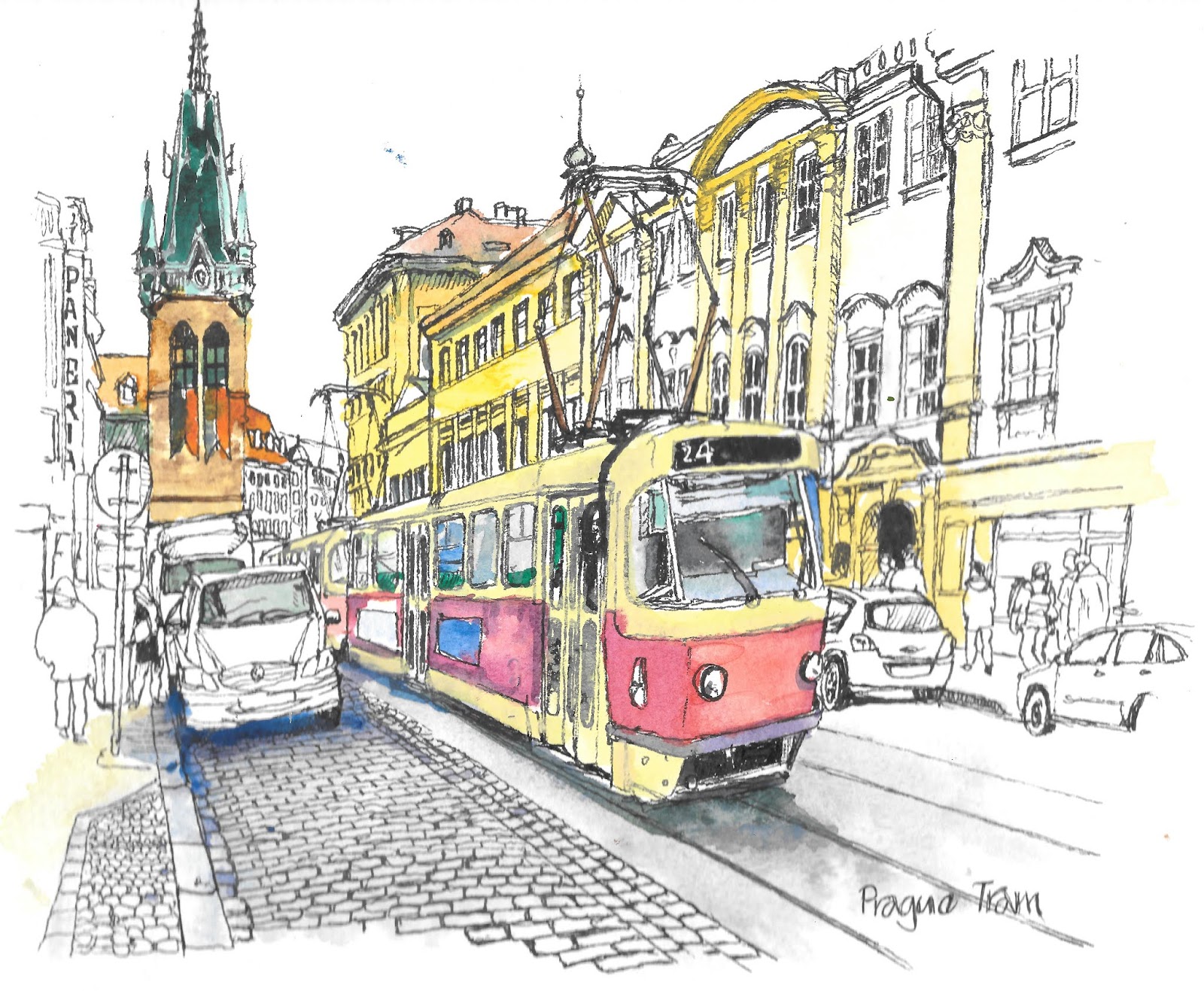
Not long after making this sketch I visited Prague. Most of the sketches I made were monochrome, but I did tray applying some watercolour to a couple. Not very successfully - far too light with the colour, and while the A5 size of my sketchbook was big enough to make some nice ink sketches, it's really small for me to do anything effective with colour.
Still, soldier on. I think part of the problem was that I really just didn't know how to go about making the kind of coloured sketch that I'd really like to do. So through the spring of 2017 on the occasions that I'd do a line and wash sketch, it would turn out something like these:-
With the sketches of JR Motor Spares and St. Josephs Church Port Talbot, bot are still very washed out and suffer from being too small and painted on cheap paper. I do like the use of the blue in the St. Joseph's sketch, although I would be a long time before I started using colour again like this.
In this sketch and those that follow, you can see that I was at least being a little more bold with colour.
This sketch below, of my bank in Station Road in Port Talbot is perhaps the closest I got to what I wanted to be doing at this point. The colour use is more blocky, and there are clearly areas left only minimally painted. But. . . it just isn't quite what I wanted. I was using some of the effects I'd seen others use, but still not having any real feeling of where and how to use them. Once again, it isn't helped by the fact that it's a small sketch on a cheap piece of paper.
By the summer of 2017 I was at least trying more consistently. The next few sketches were all made in the Alicante area. There is at least a more bold use of colour, sometimes appropriately
This sketch of the church beneath is much more like it. The colours are still weaker than they need be, but the road sign works really well. What works on this highlights one of the problems with other sketches around this time - If you make detailed sketches - which I do - on small pieces of paper - you're not going to be very effective if you also try to pain in those details.
This sketch showing the street in which my in-laws live is another of the better sketched from this time, but even so would be so much better if the Smart car in the foreground had a much stronger blue, and maybe the houses on the left were not coloured. or the colours from the right just bled slightly into them.
These were made in Berlin a month or so later.
Stronger colours certainly, but again, none of them were quite what I wanted them to be. The colours of the bridge could have been faded out more effectively, and maybe the river either left un coloured, or with just one or two streaks of blue and green.
In early 2018 I took part in my first sketch crawls with the South Wales Urban Sketchers. This next sketch was made in Cardiff National Museum of Wales.
I was really pleased with this. The combination of the different shades of green to such effect convinced me that I was maybe starting to get somewhere. I made the next sketch at the Glynn Vivian Gallery in Swansea
Looking at it now, I can see that there's nothing wrong with it that some bold use of colours which weren't necessarily there at the time wouldn't fix.
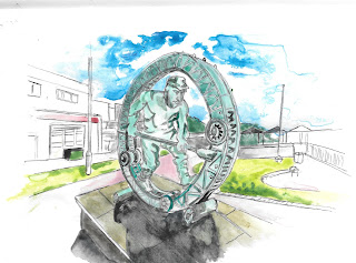
Again, this isn't at all bad, but it's too small a sketch, and would have been the better for including a little more of the buildings around it, un painted to highlight the statue head even more. This was done on a day I visited Swansea Museum, and made several unlinked sketches, some of which were painted. Analysing what didn't work with them, I tried to use the criticisms I made, and produced this during the February half term holiday
This is actually a double A4 page in my sketchbook, and you'll have to take my word that it is in fact better than it looks - the scan has flattened out some purples and blues into a more uniform grey. In this spread I was trying to use paint - colour - as a unifying factor to tie the disparate elements together, which is a trick I repeated on some other sketching expeditions.
This sketch of the derelict Palace Theatre Swansea was closer to what I was trying to do with line and wash than anything I'd ever painted before.
It was this sketch, made at Easter during a visit to the Gower Heritage centre that convinced me that I had to stop using my A4 sketchbook if I wanted to do line and wash - it just didn't absorb the water in the paint well enough, as you can see if you look at the frankly horrible painted cockerel.
Using heavier, watercolour paper, I was, I felt, at least starting to use colours more effectively
This was the same statue that I'd sketched so poorly back in 2016
I just wish that I'd sketched in a tiny bit more of the street around this building
Ditto this one, If I'd sketched even more of the scene I could have had these really vibrant colours leeching away to the sides of the painting
I was really pleased with this at the time when I sketched it sitting on a cold bench in Kaunas.I was still making more failures than half successes. The colours are too strong, and the sketch far too detailed to possibly work. I like the water, though.
As a watercolour, this is okay, but it does show that I was hidebound by trying to depict the natural colours I saw faithfully. That's fine for a watercolour, but was holding me back in my attempts at line and wash. You can see it here. This is a nice little sketch of the Duke of Wellington pub in Cowbridge, but it's crying out for an injection of colour where all the greys are.
All this time, then, I was still analysing what I was doing, and what other sketchers I admire were doing. A very fine urban sketcher I know uses very strong ink lines around his blocks of colour, which is what I did in this sketch made on Penarth Pier. It gets away from a lot of what I didn't like about my own line and wash work. I think the very bold green of the railing works brilliantly.
I used a similar technique in this sketch based on a photograph, with a similar success. I like the blending greens of the trees on the bottom on the left.
I stuck with this method with the very small line and wash sketches I made in Madrid and Alicante in my sketching journal during the summer. But when you got right down to it, while I could appreciate some of the results I could get in this way, it just wasn't my style, it wasn't a style that came naturally, and it wasn't what I was really trying to do with colour.
In December 2018, through a prompt I was given by a sketching group on Facebook, I was challenged to produce a work inspired by the work of artist Ian Fennelly. Ian Fennelly is frankly a wonderful urban sketcher. I loved this sketch of Chester: -
This is my copy.
And of course, it's nowhere near as good. However, it did help me crystallize some thought about ways I could use colour, and also about how I was going about making sketches in the first place. I love the distortion of the buildings' shapes away from the perpendicular. This led to me making these sketches: -
In this sketch of Swansea Marina, it helped that I was using a pade of thick, acrylic paper, was was not quite A3 sized, but significantly bigger than A4. I have all of the strong colour in Dylan Thomas' statue, while it fades to the left. I also deliberately distorted the perpendicular towers on the left.
This is St. Mungo's in Glasgow. I'm not sure that the distortion is totally effective here, but it does amplify the sketchiness. The scanner hasn't picked it out brilliantly here, but there's some great merging of wet on wet colours which I think is pretty effective. Speaking of effective, here's two sketches I made in Porthcawl right at the end of 2018 and the beginning of 2019.
For me these successfully combine a much freer use of colour, unpainted areas, and deliberate distortion of true shapes to finally produce something which is close to what I wanted to make when I first started making line and wash sketches.
If we look at this sketch of Eltz castle, it hasn't been done any favours by the scanner flattening greens into greys, but for me the exaggerated perspective, and the allowing colours to blend into one another really give this a magical quality. It's something I couldn't have done 6 months ago.
All of the next pictures have been produced using much the same techniques, and to my mind show a great step forward from anything I'd done prior to December 2018.


No comments:
Post a Comment