I’ll be honest, I’ve thought long and
hard before posting anything which might be thought of as a tutorial. I stress
now that I have absolutely no qualifications in art, and have not had an art
lesson since I was 14 years old, and gave it up as a subject at school. Any
skills I have are things I have picked up piecemeal, by trial and error, and
without really realising or understanding how.
However, just in the last week I have
had two different local businesses commission me to make sketches for their
material. I’ve also had a couple of people ask how they can improve their own
sketching skills. In order to come up with a reasonable answer, I’ve had to
really think about what it is that I actually do when I go sketching. And one
thing I keep coming back to, which other people harp on about, is the ability
to make relatively straight lines.
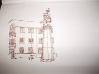
Here’s the sketch I made earlier
today.
Normally, I would prefer to sketch
from life, on the spot. However I thought that it would be easier to write this
post if I had a photograph of the scene to show you. Here it is.
Now, for me the key element of the
sketch was the sculpture in the centre. In fact when I started I hadn’t yet
decided whether I was just going to sketch the sculpture on its own, or include
any background.
Anything you sketch is going to
involve making lines, and probably a lot of these will be quite straight lines.
The sides of the main column were the first lines I wanted to make. Now, a lot
of my process of drawing an accurate line is done with my eyes. I look at what
I’m trying to represent with a line closely before putting pen to paper. The
first line I wanted to start with was the left hand side of the column. Looking
carefully, you can see that it is a diagonal, since the column tapers slightly
upwards. Rather than making the line in one go. I put a small dot on the page
where I intended to start the top of the line, and then another, slightly
closer to the left hand edge of the page, as far down as the point where the
side joins the base. I always use my own judgement on this. Yes, working with a
photo I could have measured it. For that matter, I might have used a protractor
to get the angle of taper accurate. But I’m not trying to make a photograph.
Eye reckoning is usually good enough, and your ability to do this improves with
practice.
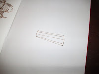
You can just about see the two dots I
started with in this picture. The next thing to do is to join the two dots with
a straight line. Now, here’s a useful tip. When you’re making a straight diagonal
or horizontal line, then turn your sketchbook around so that the two dots line
up, and you have a straight line to draw. It’s much easier to keep your pen or
pencil going in a straight line if you’re pulling it directly down towards
yourself. This is what I was doing in the second picture. You can see that I’ve
slightly swivelled the paper, and as a result it was so much easier to get a
reasonably straight line. To make the other side of the column, then, I made
another two dots. This time I had my first line to act as a rough guide , and
again, I used eye judgement to work out how far apart the top of the column
should be. The fact that the column is vertically symmetrical helped me to
judge where to put the bottom spot. This time I swivelled the page in the
opposite direction from before in order to give me the easiest straight line to
draw.
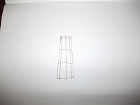
When you think about perspective as
well, here’s a tip for putting in verticals on a tapered octagonal or hexagonal
column like this. You’ve got both sides in, so the next line to put in is the
centre, which is straight. This just left me with the diagonals, which I made
by putting sports on the lines at top and bottom. The diagonal should still be
apparent, but clearly shallower than the sides.
I used the top of the column as a
guideline of how to make the horizontals one third and two thirds of the way
down the column. As before, I turned the page to ensure that I was always
pulling straight downwards.


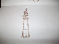
Basically, that’s the column. I still had to add the base at the bottom and the lantern at the top, but you can start to see how the sketch began to come together in the pictures below. Having got my straight lines good enough on the column it didn’t take a great deal of shading to make it zing out, and really start to look like the column. Even adding the background, where the roof line and the wall line were curved, the vast majority of lines I was making were curved, and I was using exactly the same techniques to make the straight lines for drain pipes, window frames etc.


Now, if you compare the finished sketch with the photograph, you’ll see
that this is by no means a perfect rendition of the column. But it works, and
it works because my straight lines a re pretty consistent with each other. And
that’s really not so difficult to achieve – as I said, a straight line can
actually take you a long way when you’re sketching a building.


No comments:
Post a Comment