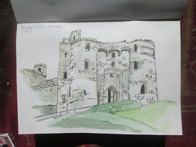
Actually, I look at this now, and I think that it's not as bad as I once thought it was - for a long time I hated it, and despite me having on many occasions said that you should never be ashamed or try to hide your own work, I did feel annoyed with it. Why? Well, this was one of my early line and wash pictures, and it didn't end up looking anything like I wanted it to look. Why? Well, the ink dominates everything since I think that the ink outlines are just too heavy here. Also, it might have benefitted from some ink shading as well, apart from just shading in all the windows completely. More than anything else, though, I made the beginner's error of being afraid of colour, and applying washes which are just too pale.
 So let's come forward to last year, when I made this picture in Kidwelly Castle again:- Now, I'm very pleased with this one, which I made as a direct watercolour. So you can certainly say that the paint isn't overwhelmed by the ink outlines, as there aren't any. It is actually better than it looks in this scan, since my scanner doesn't always pick out blue very well - the sky is less blotchy than it looks here. The shadows within the doorway arches I like here, and generally I think it's quite a successful composition. However there are just a couple of features which ight have been a little more distinct if I had made some minimal, judicious use of ink outlines.
 This last picture is the one I posted a couple of days ago, and wasn't made in Kidwelly Castle, but the rather less impressive Ogmore Castle outside Bridgend. This is a genuine line and wash picture, and I'm pleased with it. Well, I'm always pleased with a picture just after I've finished it - in most cases. I like this because I'm using the colour as effectively as in the previous picture - in fact probably a little more effectively, but also the ink complements the paint, working with it rather than dominating it. This is a lot closer to what I wanted to do with line and wash when I made the first Kidwelly Picture.
* I made the key decision when I started that I was going to take a double page spread in my sketchbook. This would mean that I wouldn't have to really squeeze the scene down to make it fit, which also meant I could include more details.
* I started on the sketch intending that I'd make the monochrome ink sketch, and decide later whether to apply some watercolour. However, in order to keep my options open I didn't apply as much hatching and cross hatching for texture as I might have done. Likewise, I deliberately left a lot of areas for the paint rather than the ink to create the texture.
* I ended up spending a lot of time working on the main layer of ink. It was only when I had most of the ink down on paper that I made the decision to apply colour.
* The first wash I applied was the blue wash for the sky. I moistened the areas where the sky was going to be with a wet brush, then applied the blue immediately onto the damp areas. It is actually a lot more even than the scan suggests.
* The second wash was the grass. I applied a layer of blue to the shadowy areas on the left. Then I waited for sky and grass to both dry before applying more.
* I worked with successively darker washes of brown, mixed with varying amounts of dark blue and crimson to the stone work, applying the lightest wash first, and allowing it do dry. Dabs with a small brush created the stone work.


