However, this doesn’t mean that I don’t try,
and maybe I’m kidding myself, but I do think that I’m improving. If I show you
what I think as some failures and successes, and draw what advice I can from
them, then hopefully you might agree.
* What have I learned?
1) Don’t be
afraid of colour
Compare this sketch which I made in 2016 : -
With this sketch of the same piece of
sculpture from 2018
The later sketch is better drawn in the first place. It has a more appropriate use of detail, and the angle is far more dramatic for the viewer. But even allowing for that, the colours are so much more vibrant on the bottom sketch, while those on the top one look weak and washed out. Generally it’s better to go too bright, rather than too watery. I didn’t leave the large areas of white negative space in the bottom picture either, and this seems to have worked better for me.
2) You can
use colour to unify disparate elements in a page in our sketchbook.
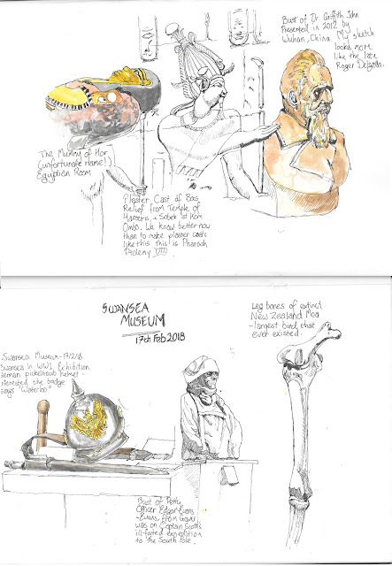
Now have a look at these two pages made during
a solo sketch crawl: -
Now, as individual sketches I didn’t feel that there was anything drastically wrong with either page. But the sketch elements have not been linked together at all. Compare them with these two pages, made literally a couple of weeks later: -
Colour here is the linking principle between
the disparate elements of this sketch made in the Waterfront Museum in Swansea.
On a slightly smaller scale, this sketch from the Swansea tramshed museum works
with colour in a similar way: -
3) It can
make a huge difference the kind of paper that you use.
One of the difficulties of making these colour
sketches was that I’d been using my sketchbook to do so, and while it’s great
for ink sketching, it makes it harder to use watercolours than it should be,
since the paper tends to resist, meaning that you don’t get anything like an
even spread of paint off the brush. So if you are considering trying to add
watercolour to an ink sketch, you might do well to make your sketch on
watercolour paper. For example, compare: -
This is a sketch from Gower Heritage centre
made in my sketchbook. Compositionally I think it’s great, but apart from a few
areas it still looks washed out. I had the devil’s own job painting in the
cockerel’s brown feathers, for example. Since struggling with this I’ve always
tried to use more appropriate paper if I have any intention of adding colour to
a sketch.
4) You can
get better results using minimal ink lines, and using different tones to create
shading.
Now this: -
-is a sketch that I made in Kaunas, Lithuania,
and it’s one of very few sketches where I think that I was close to achieving
what I was trying to do with line and wash. I think that this can be ascribed
to the fact that I knew that I wanted to make this a line and wash picture, so
I consciously cut down the amount of detail that I put in with the pen. I left
the shading for the paint.


No comments:
Post a Comment